


- Tutorial -
Since I started doing Kaspall, people have fairly regularly asked me how I make it. So I thought I might as well do a tutorial type thing, showing the stages a page goes through. Hopefully, it will explain things slightly better than I can over email - though if you do have any further questions about it, then feel free to send me a message and I'll try to answer in a way that makes some kind of sense.
So, assuming you want to make a comic exactly the way I do (not recommended - it's a little time consuming), this is how you should go about it.
So, assuming you want to make a comic exactly the way I do (not recommended - it's a little time consuming), this is how you should go about it.
| Jump to: | Script | Thumbnails | Inks | Scanning and processing | Finish |
1 - Materials
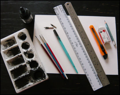 You Will Need:
- A sheet of card (I use 210 × 297mm
- A pencil
- An eraser
- A knife (for sharpening the pencil - pencil-sharpeners aren't nearly as good for getting a point)
- A steel rule (everyone should have a steel rule)
- A ruler with a lip (so the edge is raised off the card)
- A dip pen with two nibs (one fine, I use a mapping nib; and one not so fine, I use some nib that I don't know the name of)
- Three brushes (size 000, 0, and 'wider brush I found in a draw')
- A palette
- Some black ink (and I mean proper black. I looked around for ages before I found one black enough - Dr. Ph. Martin's Bombay Black India Ink. Don't bother with Windsor and Newton's Black, it's a grey in disguise)
You will also notice that I don't know as much about my materials as maybe I should. On the whole, I tend to use whatever is available when I suddenly decide I want to do something. You might like to be a bit more well-organised than that.
You Will Also Need:
- A computer
- A scanner
- The internet
- A limited social life
2 - Script
The script always comes first.When I write it, I do include ideas about how I want things to look; but I nearly always have the dialogue sorted out before I start drawing. I also aim to have the script for a whole scene complete before I start to sketch out the first page. There's two reasons for this - first, the scene seems more coherent and less "bitty" when I do it like that; and second, it's bloody annoying if you get halfway through drawing a scene and realise you should have put a door / fruit bowl / leopard in the corner on the first page, so the characters can interact with it later on.
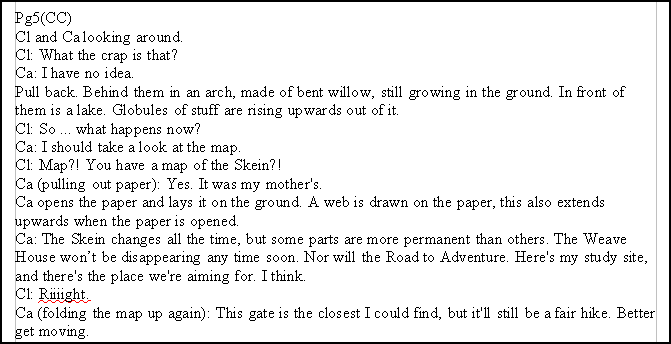
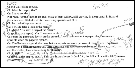
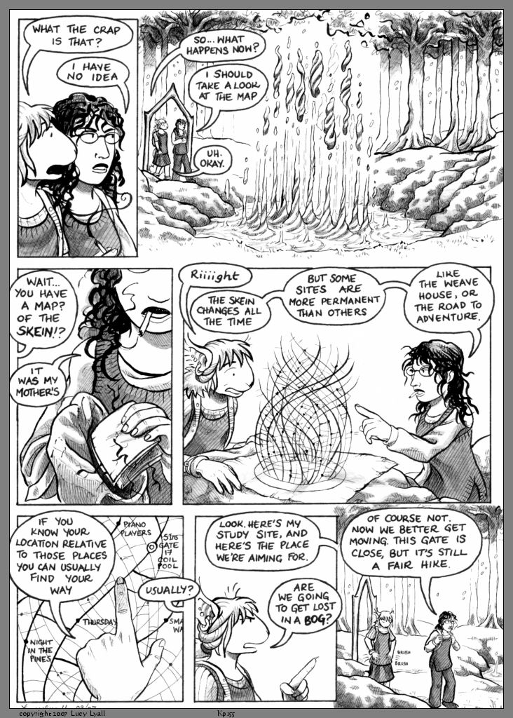
This is the script for page 155 - it's labelled 'pg 5' because it's page 5 of scene 16.
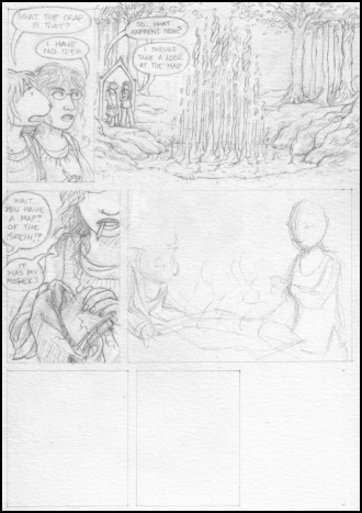
3 - Thumbnails
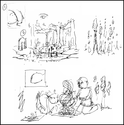 Once I've got the script sorted-ish, I start scribbling out some ideas for how I want things to look. This is where I work out the structure of the page - how many panels I need, what shape, what they'll show, where the dialogue will go etc.
 I should mention that my thumbnails are always a mess. I mean look at them. I've clearly spent most of my time working out what those damn twirly things will look like, even though they'll probably never be seen again. There's a couple more pages of this, but they're not very interesting.
I often have to cut out dialogue at this point, if there isn't enough room. This isn't always a bad thing - cutting often leaves you with something better. In this case though, I altered it because it wasn't saying quite what I wanted.
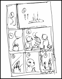
| After all that, I'm left with these two hugely important bits of paper. Which I lose repeatedly over the next week: | |
 |
 |
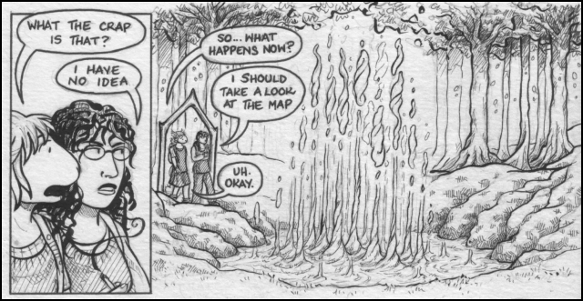
4 - Pencils
 Panel borders first, fairly obviously. This is where you should be using your steel rule.
Then ... well, everything else. My pencils are pretty heavy-duty on the detail compared with some. I just don't trust myself enough to guess at the inking stage, so I try to get everything down now.
If I have a particularly difficult pose to draw, then I'll usually get out the digital camera. My boyfriend often gets roped into being a corpse or crouching under the table or something, so I can take a couple of photos for reference. I also use the mirror a lot for facial expressions.
Unfortunately, on this page the hardest things were the pool and the map. As they're clearly made-up I can't get much in the way of photo reference. Instead, I just have to keep drawing it until I think it looks right - hence the thumbnails.
As you can see I draw the speech bubbles in as I go.
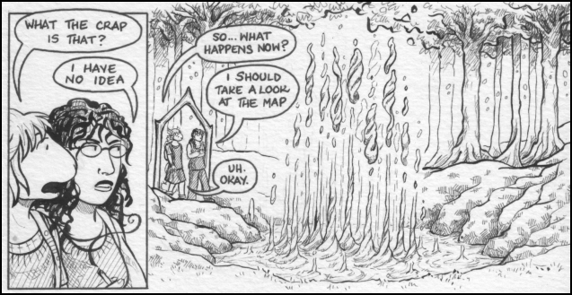
5 - Inks
As you might expect, I go though several stages with this.Speech bubbles
At the moment, I draw these in with the dip pen and thicker nib. I used a 0.5 drawing pen for ages though (in fact, I used to draw the entire comic with pens), I think that's what was using in this example.
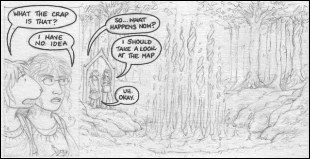
I added in another speech bubble here (Claudia saying 'Uh. Okay'), after the pencils were finished. This was a timing issue - the second panel is so huge it makes a pause in the dialogue as you read it. In the script, Caroline says 'I should take a look at the map' and Claudia straight away replies 'Map?! You've a map of the Skein?', but with the pause / space that sounds wrong - like she's being dopey. So, changed it to: 'Okay' (pause) 'Wait ...'. It still sounds a bit dopey, but not as unnatural - she's just not listening because she's staring at the great big twirly thing. Which is fair enough, really.
Panel borders
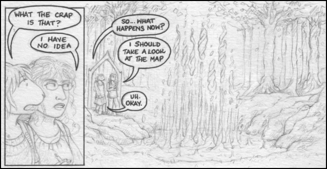
Again, I used a drawing pen for this page, but now I use the dip pen. This is where you need the ruler with a lip. If you don't use a ruler with a lip, the ink seeps underneath it and leaves a giant black smudge on the page. Trust me, I know.
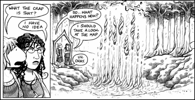
Brushwork
Next, I go over the major lines with the brushes. I use the 000 size for most things, but I like to use the thicker 0 size for hair.

I much prefer using a brush to a drawing pen now. It took me a while to take the plunge, and it looked a bit ropey for a few pages (the first one I did with a brush is page 73). But I got used to it a lot quicker that I expected, and you can do a lot more with one brush than you can with one pen. For example, I would have needed two pen sizes to get the difference in line between the foreground and the background trees here.
Also, I think I brush just gives a better looking line for this comic - it's nice and smooth, which is what I want. I might go back to pens if I wanted a different feel or look though.
Pen shading
Mapping pen (or, previously, 0.1 drawing pen) for the detail and shading. This takes a lot less time than it looks - mainly because I put so much of the shading in when I do the pencils, so I know exactly where everything has to go.
Erase pencils
You don't need me to tell you how to do this, right?
I went back and added a bit of shading to the twirly blob things after rubbing out the pencil. I'm sometimes hesitant with inking, as it's hard to fix if you get it wrong - but they looked to unreal without any shading at all.
Ink washes
And finally, the ink washes. I mix the black with some water, and wash over the shaded areas with the 'wider brush I found in a draw'.

Every so often, I'll consider dumping either this stage or the pen shading stage as, in theory, they both do the same job and take extra time. But I like the extra body the ink washes give everything, and I like the preciseness of the pen - so in the end I just stick with doing the same old thing.
6 - Scanning and Processing
600 dpi is recommended in a number of places as the minimum required quality for printing black and white art, and it's good to have saved print-quality versions of your work in case of disaster - so if you can scan at that level then you should.Once I've scanned in, I use Paint Shop Pro to balance the black and white points (basically converting some grey pixels to black, some to white and some to another grey). This gets rid of a lot of the mess, plus the texture of the card. Then I go over the image and erase any mistakes and bits that haven't vanished yet. It ends up looking like this:
I save the high resolution version, then resize the image to 9cm wide (about 740-odd pixels). I add the borders, then the page number at the bottom and then ...
Well. When I say done - now it's Monday again, and I need to start at the beginning for the hundred and fifty-sixth time. Anyway. Hope that was in some way useful and / or interesting.
Thanks for reading!